
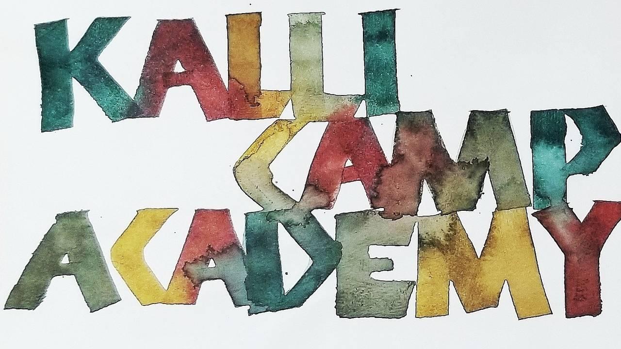
Writing Broad Edge Neuland
Neuland is a German typeface that was designed in 1923 by Rudolf Koch. Because he designed it by directly carving it into metal, the original had a great deal of variety between sizes. I personally love this script because of how expressive it is and how easy it is to play around with it and the different forms of supplies you can use. I drew inspiration from the Neuland typeface and a few exemplars that I have studied from and created a fun way to learn Broad Edge Neuland using parallel pens. We will be staying with 0 degree and 90-degree pen angles, so those who have never tried broad edge calligraphy before will find it relatively easy to learn this script.
Want to join us for class? It's offered on-demand and available now for all Tier 2 students. Some classes are also available to Tier 1 students. Click here to see the Tier 1 Class Listing.
How to Access Your Members-Only Class:
- Go to www.kallicampacademy.com
- Log in to your account
- Click on Classroom
- Click on Tier 2
- Scroll to Current Classes
Let's get started!
Topics Covered
- Supplies needed
- Writing space and writing zone
- Body position and hand position
- Getting to know the Pilot Parallel Pen
- 0 degree and 90 degree pen angle exercises
- Broad Edge Neuland
Want to join us for class? It's offered on-demand and now available to enrolled students. Enjoy this video and printable worksheets today!
Materials Needed
Getting to know your Parallel Pen:
- Pilot Parallel Pens (6.0 for beginners or 3.8). I will be utilizing the other two sizes for blending, so bring the other sizes if you have them. Make sure they have a cartridge that you can remove or are empty.
- jar of water
- The blue flushing bulb and black film (acetate) that came with your packaging. If you do not have the black film, you can trim a small piece of acetate (2x2).
- napkin or cloth
Broad Edge Neuland:
- Parallel Pen (6.0 recommended for beginners or 3.8)
- Printed guidelines for the parallel pen that you will be using
- You can use a layout bond paper (ex: Strathmore or Borden & Riley) to lay on top of your printed guideline
- Walnut ink or any water based ink
- Gum arabic (If your ink is too thin, you can add a drop or two of gum arabic to your dinky dip of ink. Practice decanting ink into a smaller container such as a dinky dip to avoid contamination and waste if ink gets knocked over. If your nib skips, condition the exposed portion of your parallel plates (nib) with a drop of gum arabic to help ink stick to it better.)
- A padded writing surface such as a writing pad or a few sheets of paper. A cushioned writing surface allows the nib to glide better on the paper and have a better reaction to pressure.
Homework Challenge
Want to see our students homework? Search the hashtag #kcaneulandhand on Instagram to see samples from this week's homework. Our students who participate in this challenge get entered into a drawing to win prizes.
Instructor: Jane Matsumoto

Instagram: @ginkgoarts
Facebook: @ginkgoarts
Download our Master Supply List FREE when you become a Friend of the Academy.

Categories
All Categories